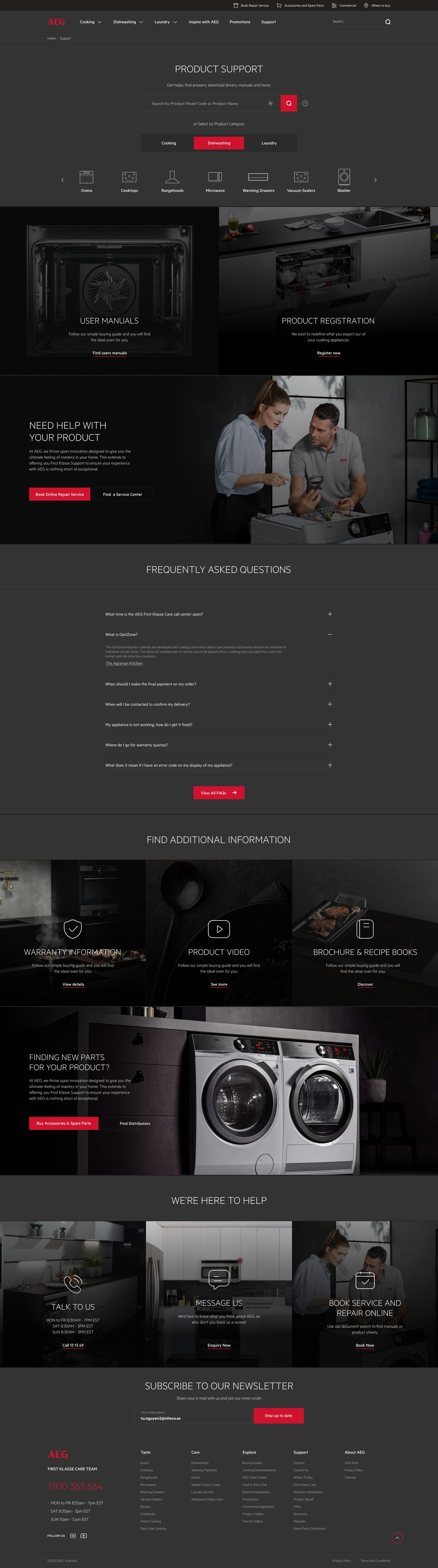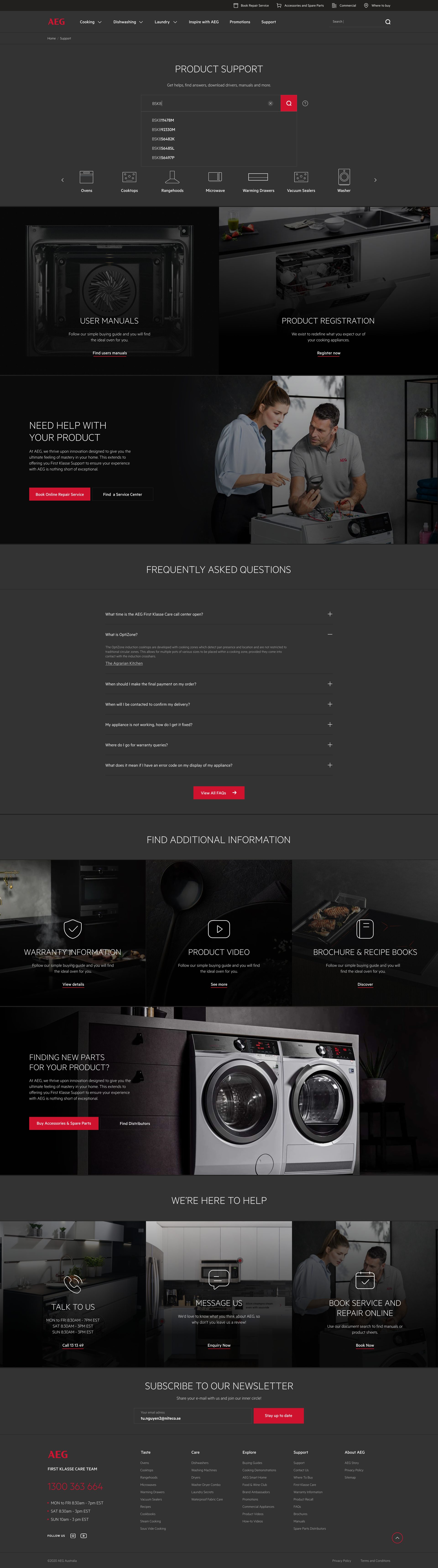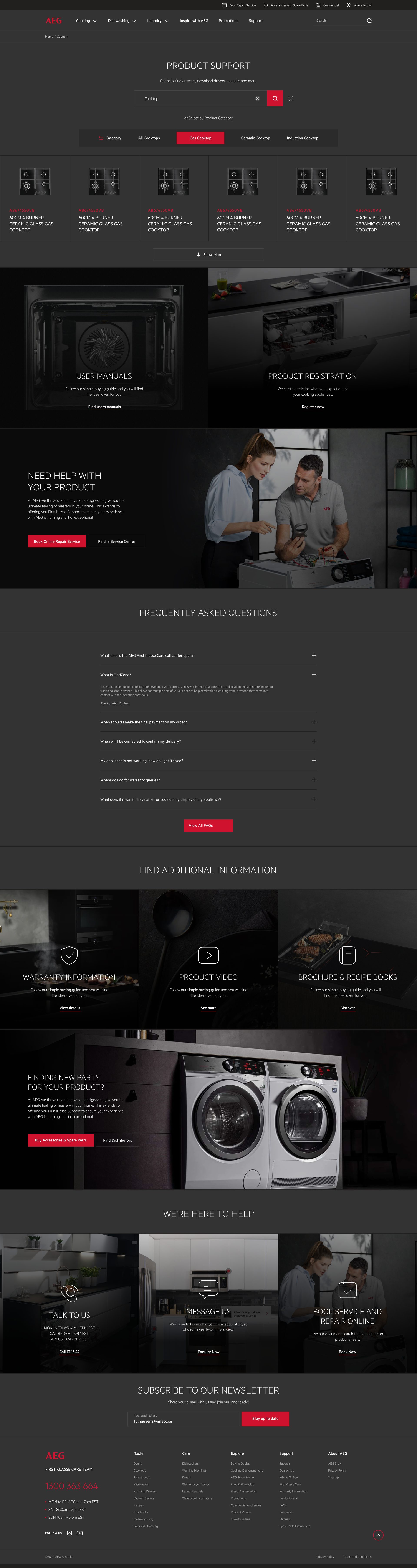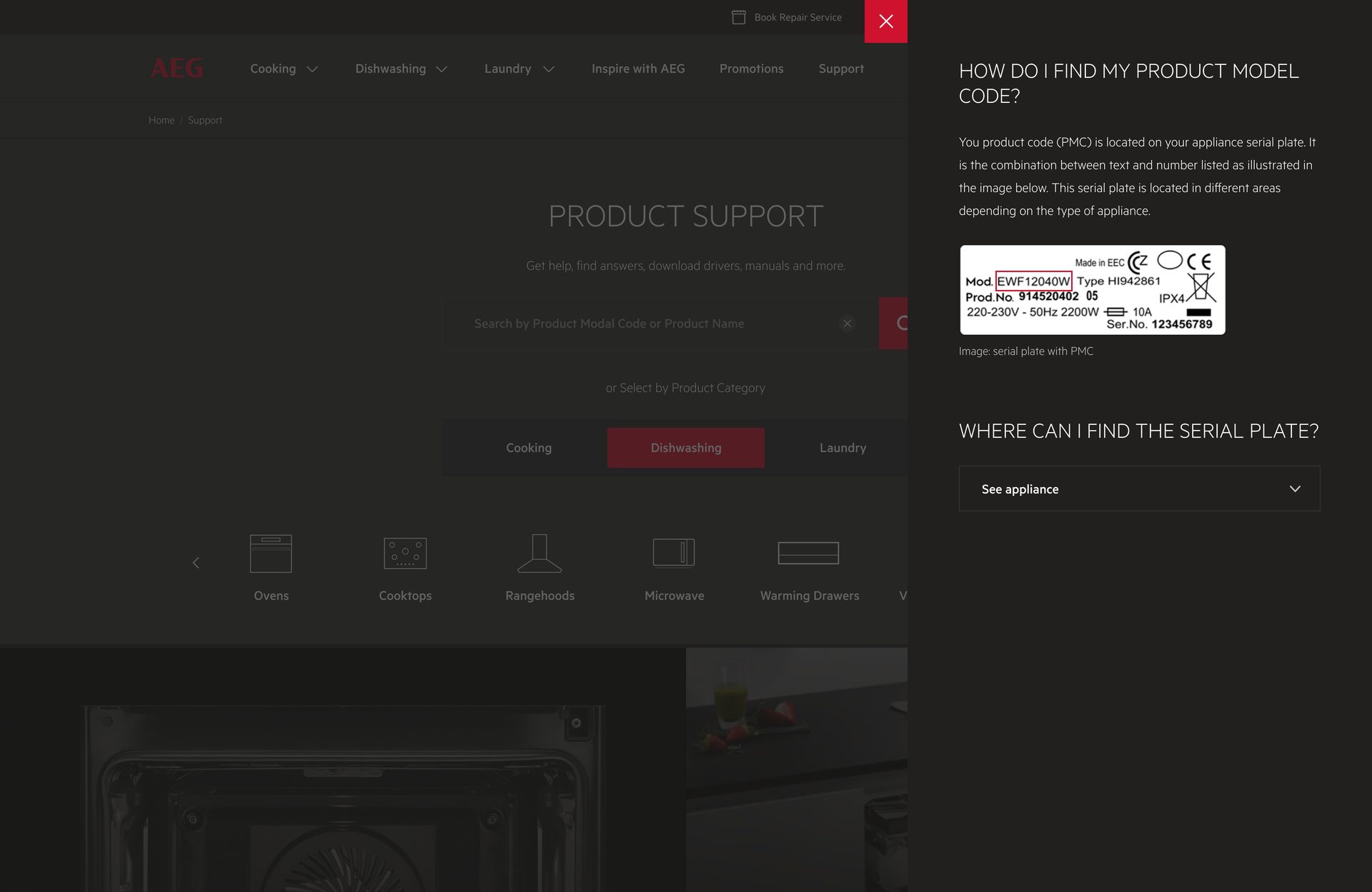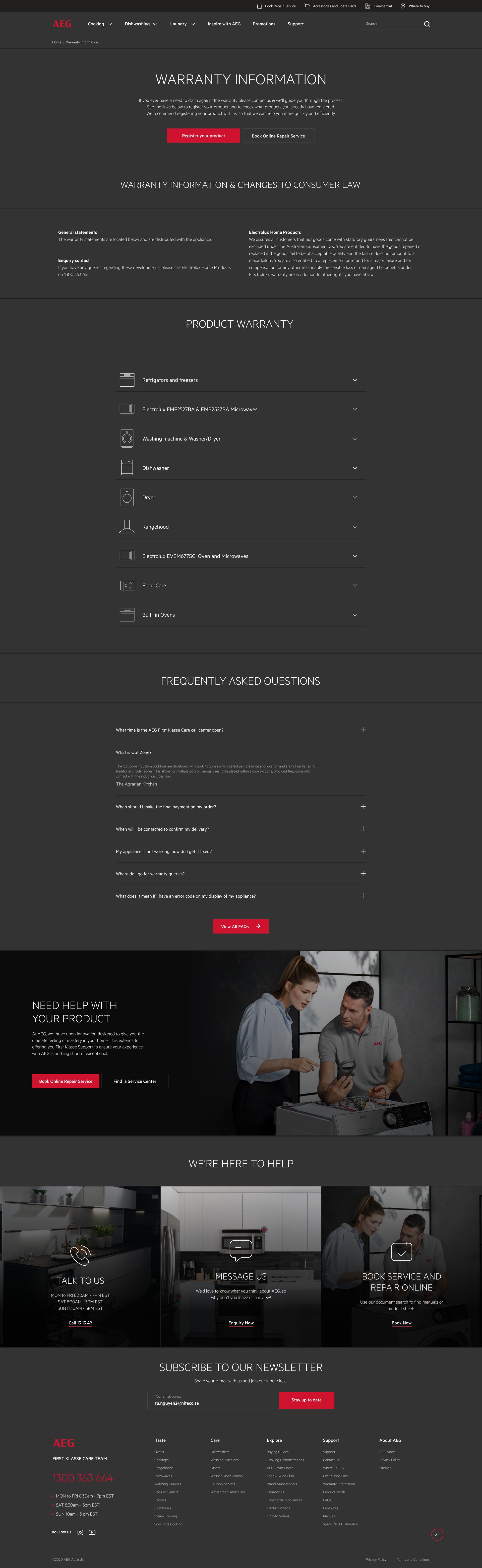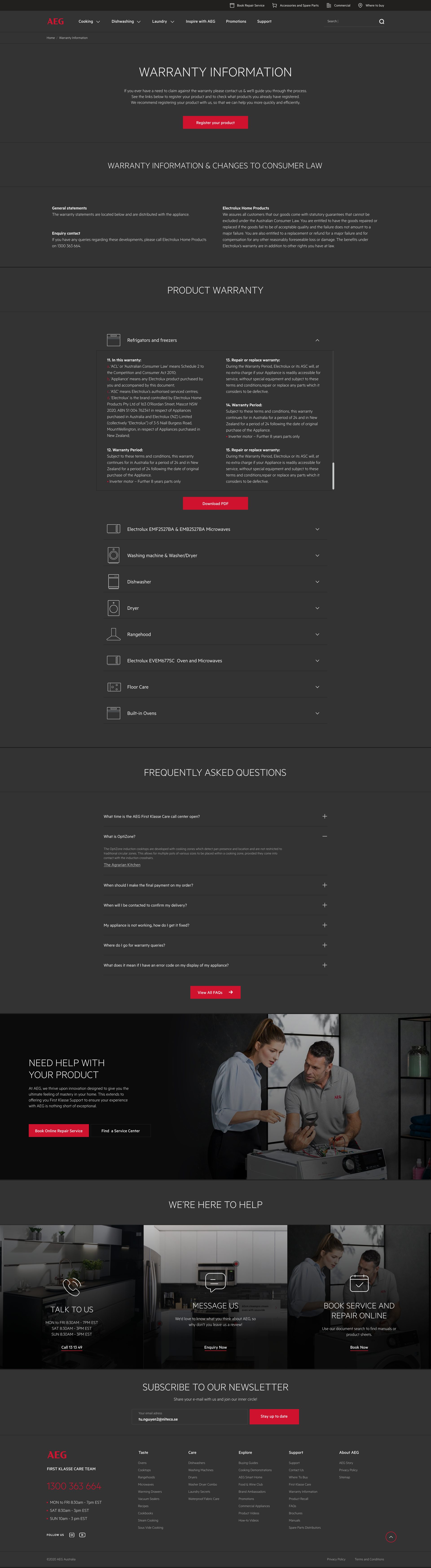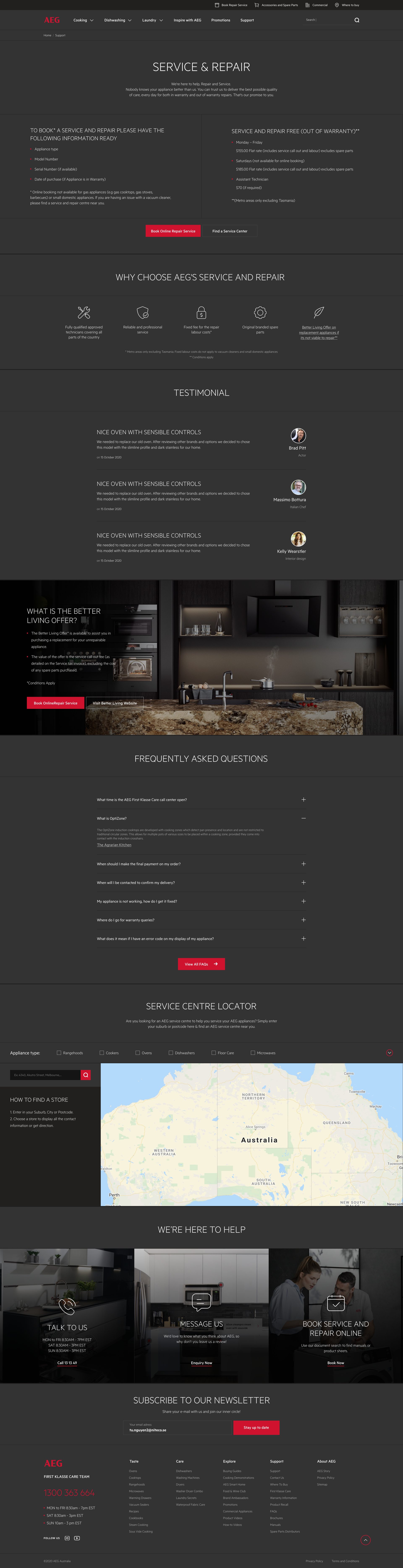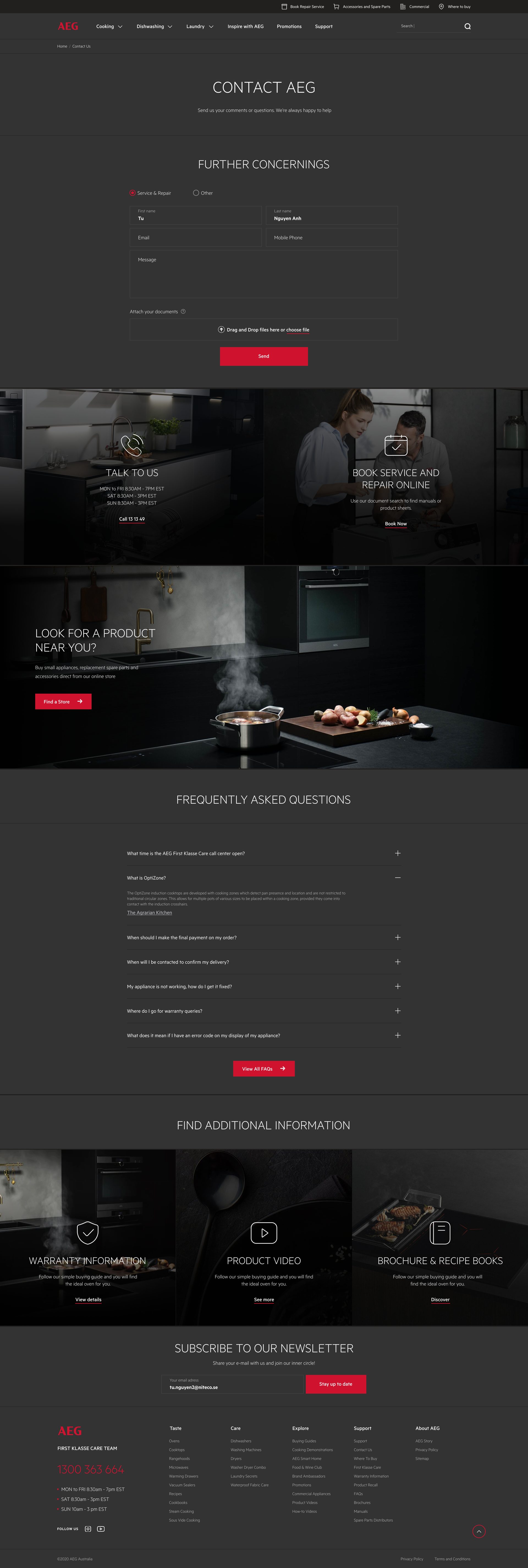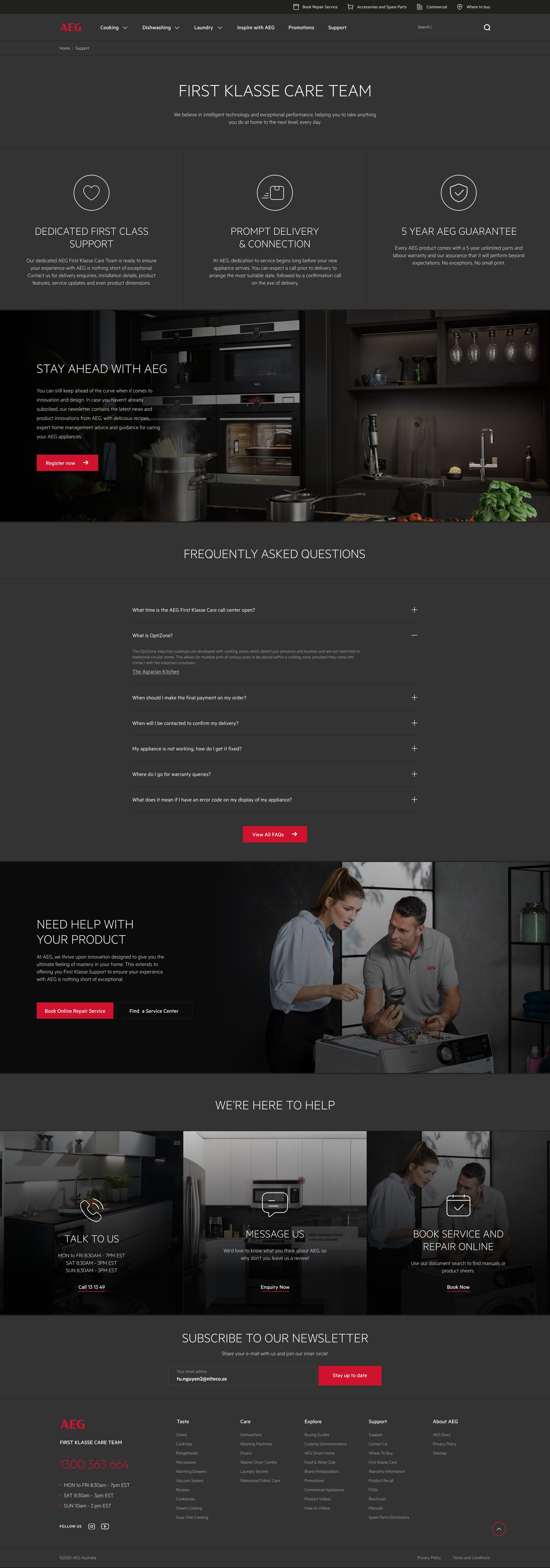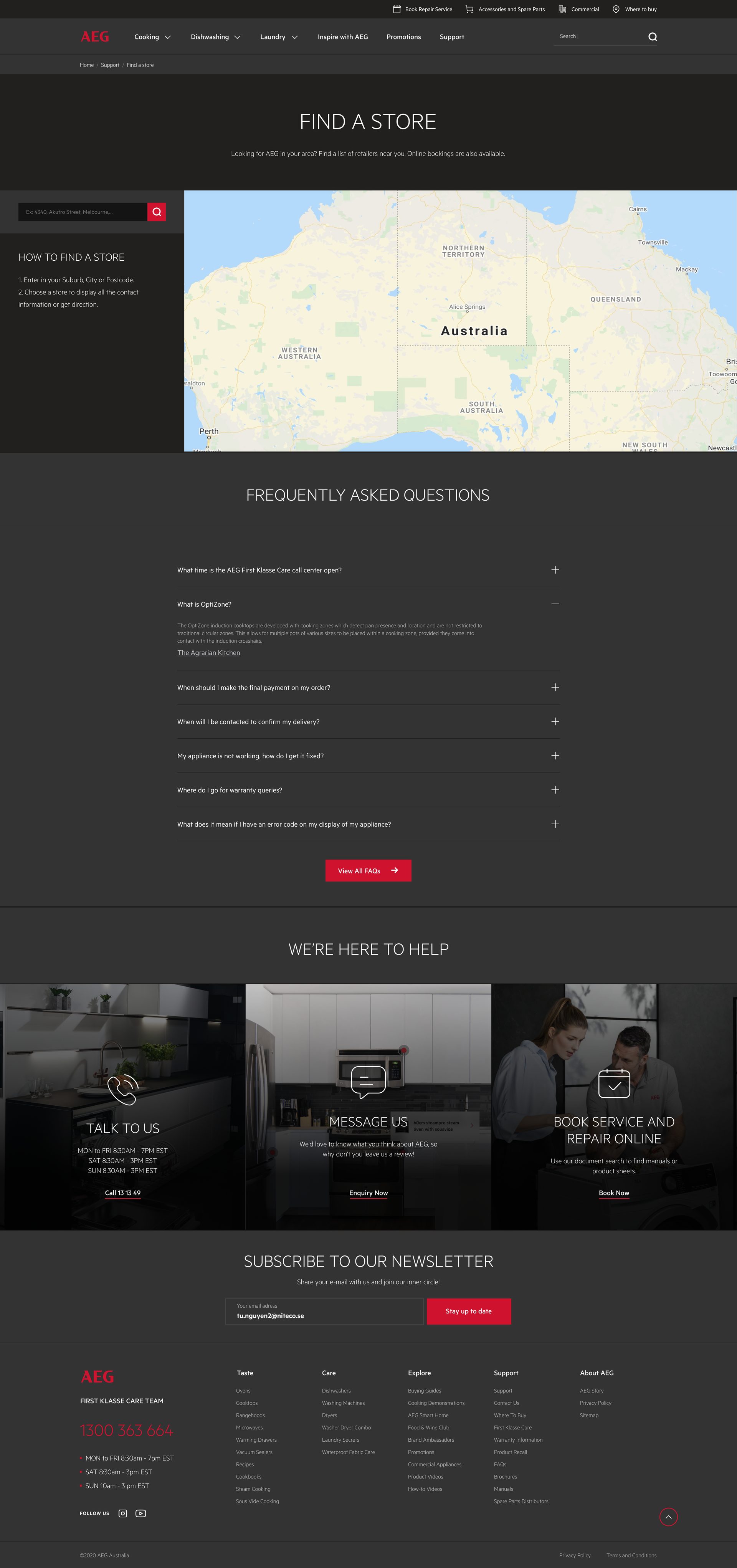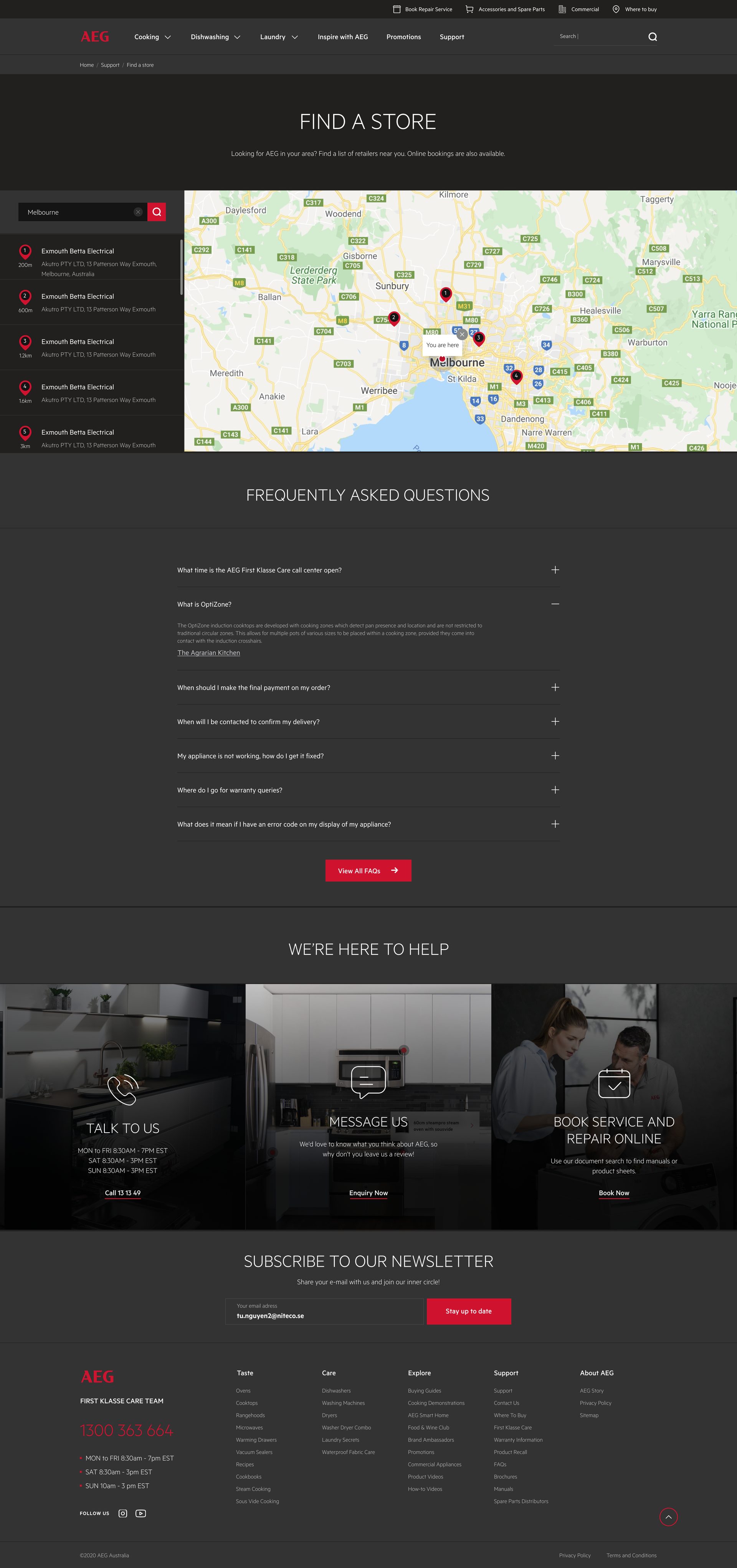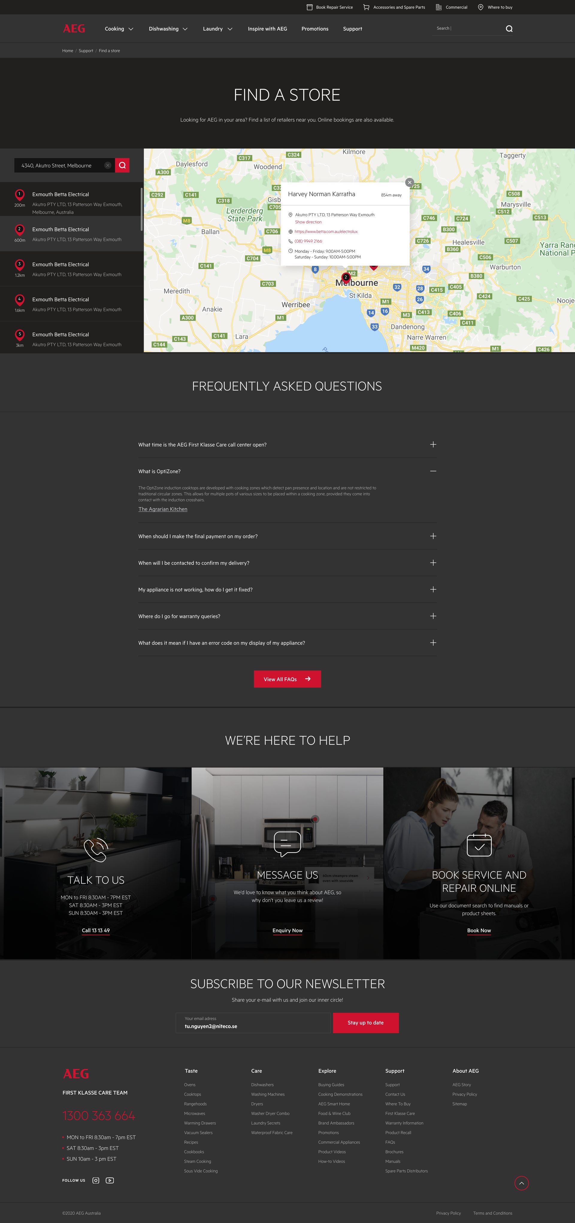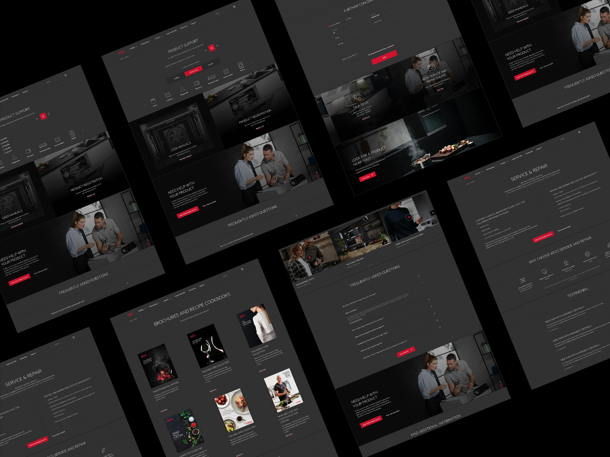
AEG’s product support, built so customers find answers themselves.
As the main product designer for AEG’s support page, I used scenario-based research and a reworked information architecture to create a self-service support experience, resulting in an about 20% reduction in support workload.
GoalHelp customers find product support on the website without waiting for the support team.
View it live ↗The live page has evolved since my 2021 delivery.
- Scenario-based research that shaped the information architecture
- Wireframes and prototype reviews with AEG
- Brand-aligned UI and the responsive versions
Start with the scenarios: what do customers come here to do?
I chose scenario-based research to decide how to organise the support page’s information architecture, so customers can find what they’re looking for in the shortest time.
Six steps, from scenarios to a validated structure.
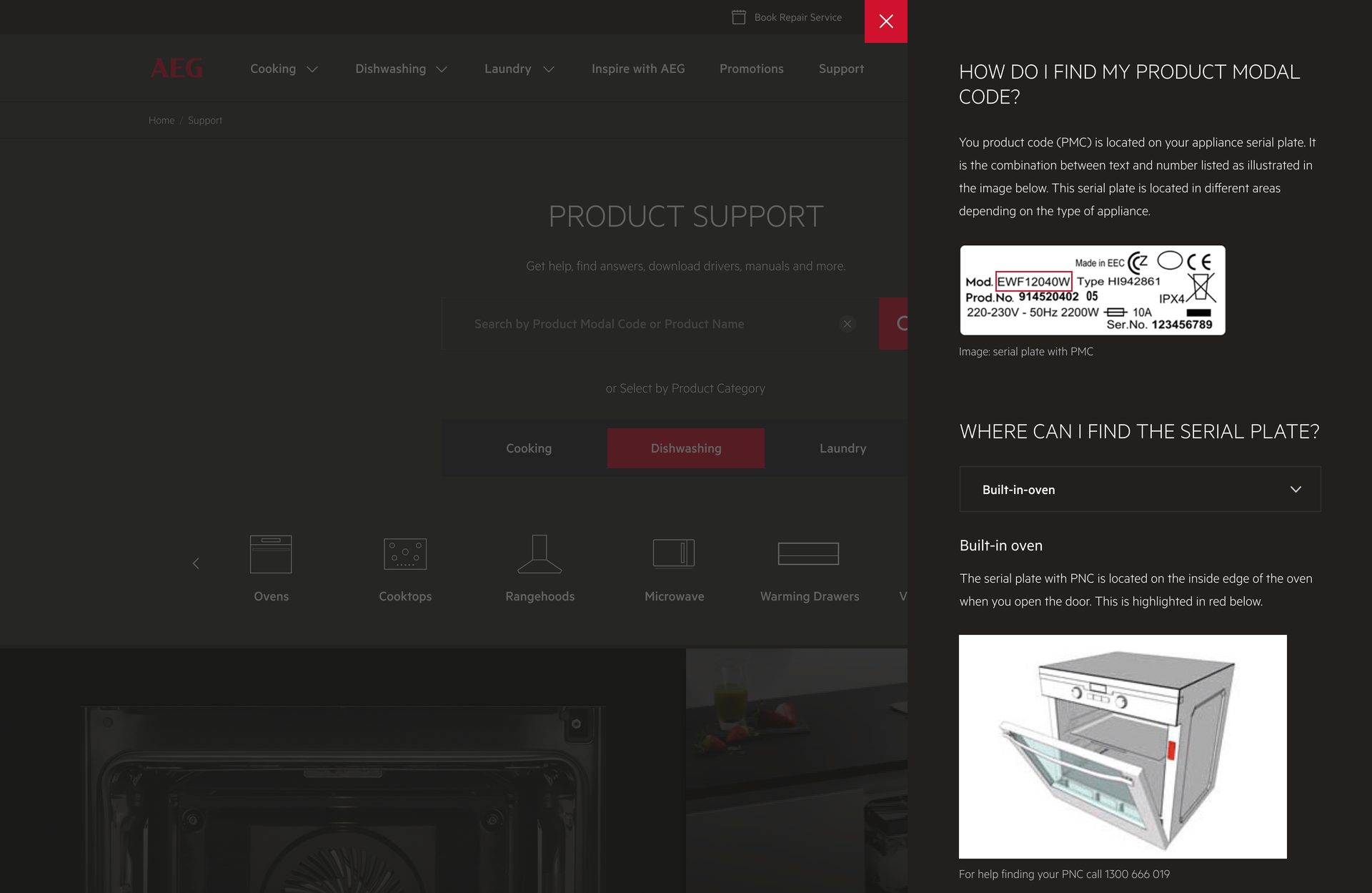
Defining user scenarios. I identified the typical tasks users perform on the support page, such as looking for the QR code to register for a guarantee, or understanding the return policy.
Creating prototypes. Low-fidelity prototypes, focused on key information and navigation structures.
User testing. Paper-based tests, to observe how users navigate and find information.
Gathering insights. I analysed user behaviour to find the intuitive sections and the areas of difficulty.
Iterative refinement. I refined the layout and navigation based on user feedback, so critical information stayed easy to reach.
Validating the architecture. I kept testing and improving it to meet the most common user needs.
The result: a support page where people quickly find what they need.
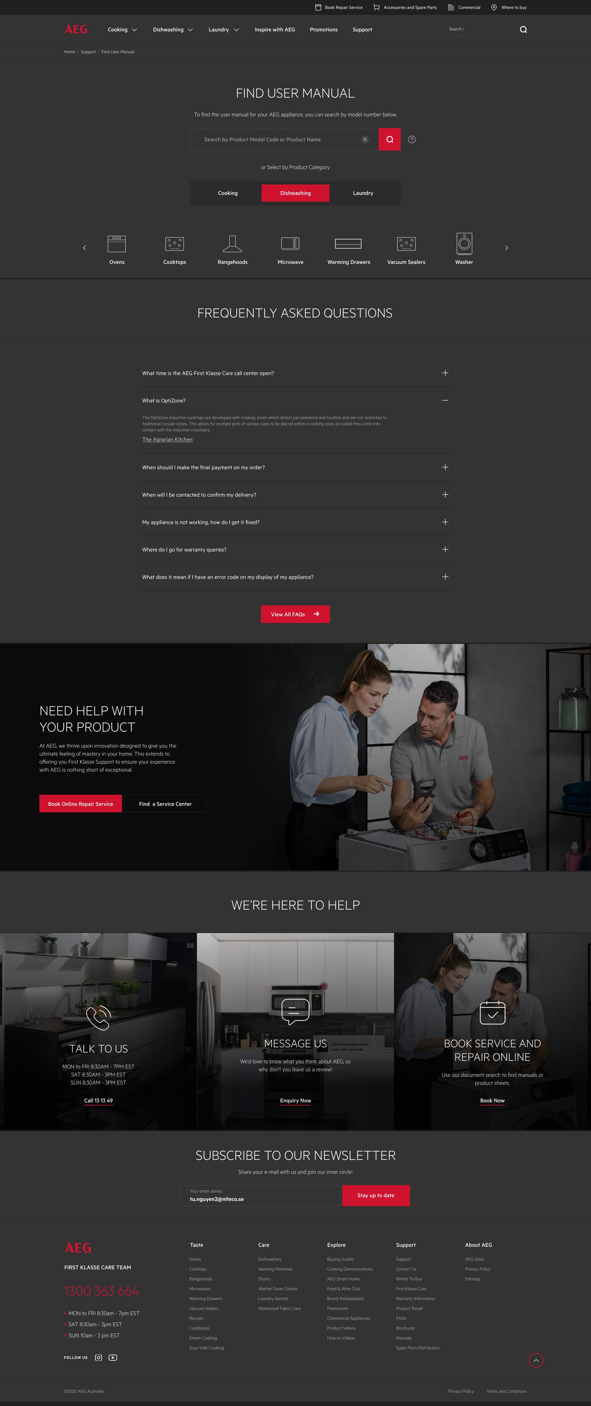
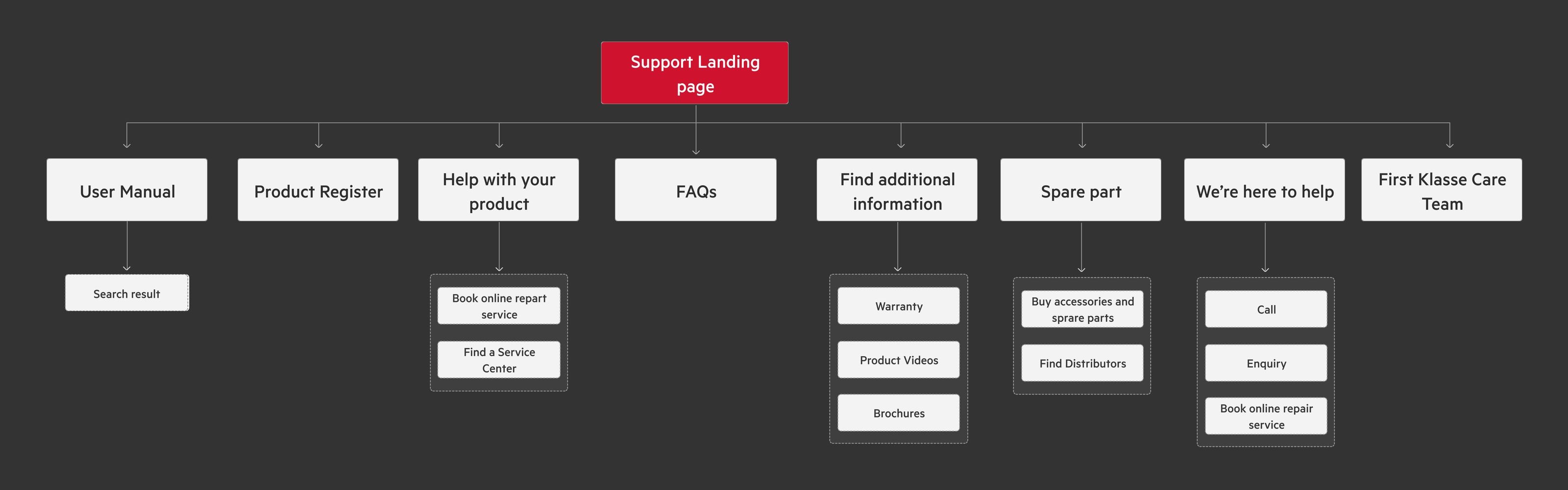
The research led to a user-friendly support page and a better experience on AEG’s e-commerce platform. This is the information architecture, in priority order from left to right, based on the research data.
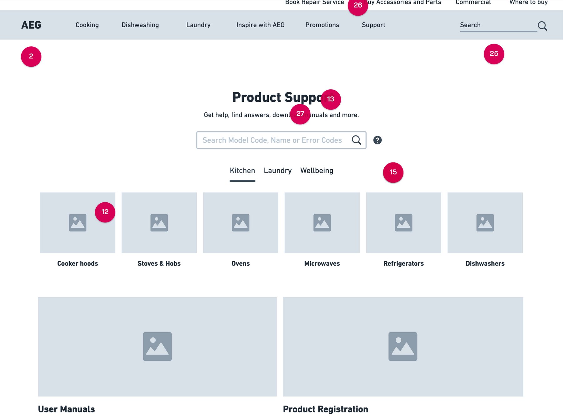
Wireframes, reviewed with the client until the needs matched.
I turned the research into an interactive prototype and reviewed it with AEG. The sessions showed me what the business needed. I kept checking that against what customers come to this page to do, and adjusted the experience until it worked for both.
AEG is the premium end of the Electrolux group, and the page had to feel like it.
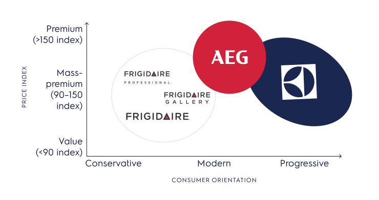
AEG sits at the premium, modern end of the Electrolux group’s three main brands.
Four brand attributes guided every decision.
The support page had to feel as premium as the product without getting fancy. These four attributes kept each design decision aligned with the AEG brand.
Being premium
As the only premium product line in the Electrolux chain, the AEG team asked us to align with the brand and stay premium.
Intuitive navigation
Navigation is everything in this feature. From the customer’s view, every high-value service needs to be visible and easy to find.
Simple wording
Being premium doesn’t mean the wording needs to be fancy. Simple, common words are the best choice here.
Identity recognition
The brand identity always needs to stay aligned, so people recognise it quickly — through icon colour and small borders.
Rounds of back-and-forth with AEG led to one design that works on every screen.
Reaching the final design took multiple steps and continuous engagement with AEG. That iterative process was crucial to building an effective support page: it kept the design responsive to what users needed, and led to a better experience for customers and greater efficiency for the support team.
Continuous iteration
Each review round tightened the design. I built a flexible visual identity that could be used in any application.
Organised system
On the way to agreement, I supported AEG with a design system, so the product is more aligned and easier for the next designers to use.
Responsive versions
I designed and supported the responsive versions for mobile and iPad screens, to bring the best experience to end users.
Mapping platforms
The same content and features appear on mobile, tablet and desktop.
Responsive UIs
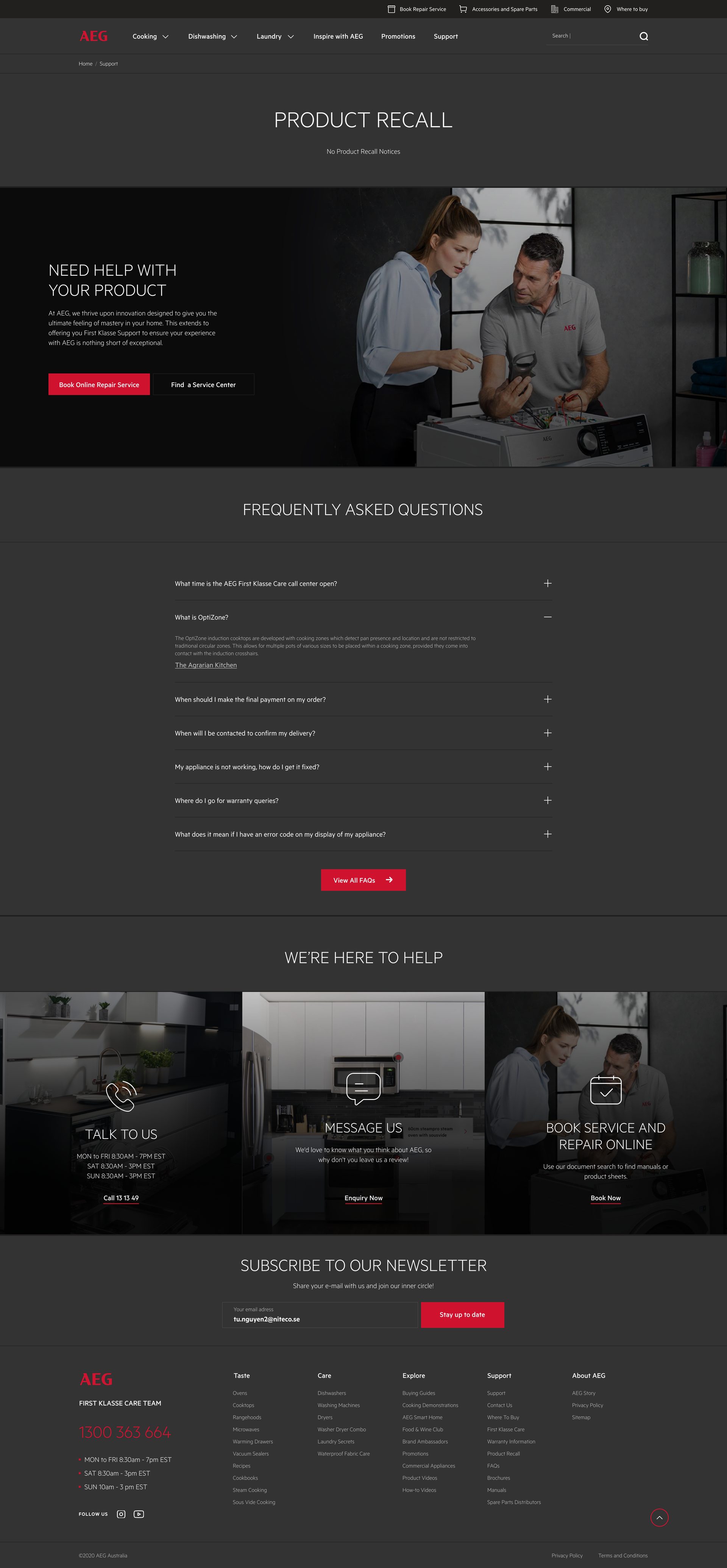
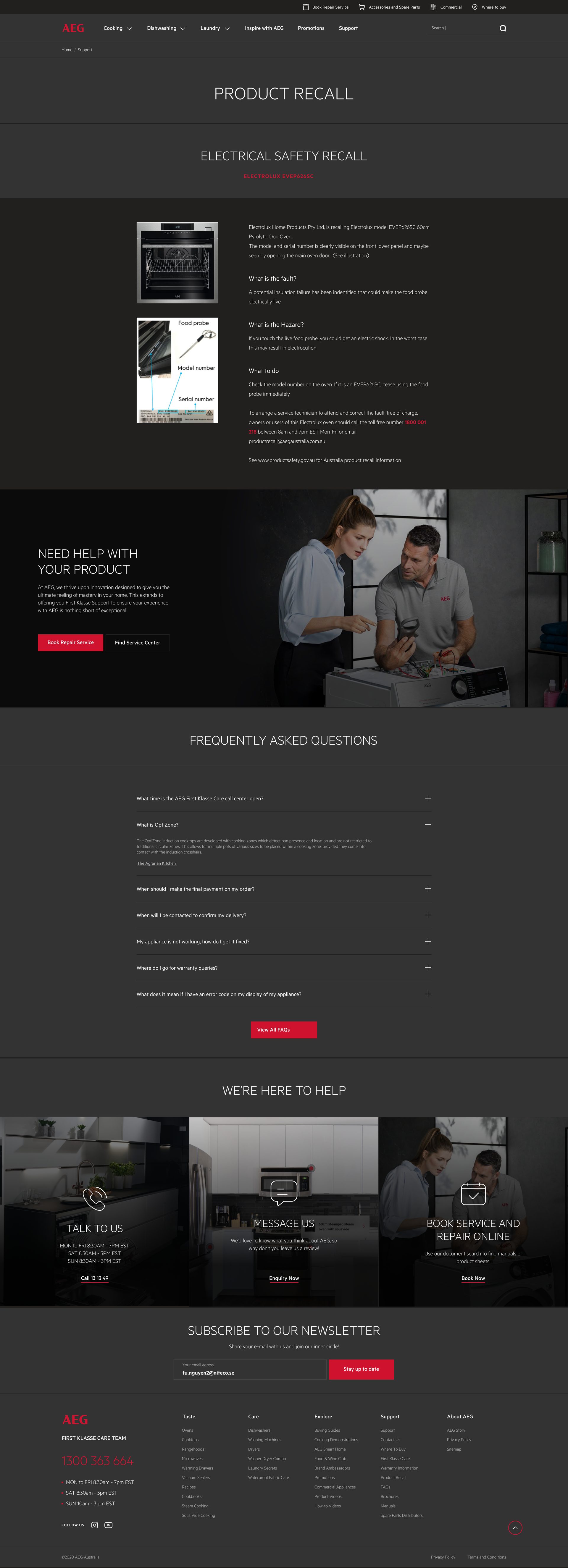
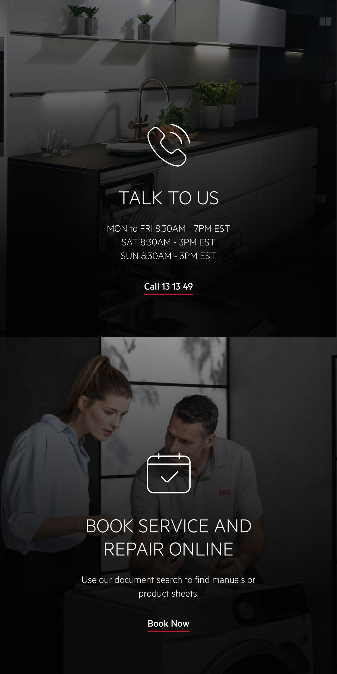
Nine support screens on phones, and the product recall page on a laptop, two tablets and a phone.
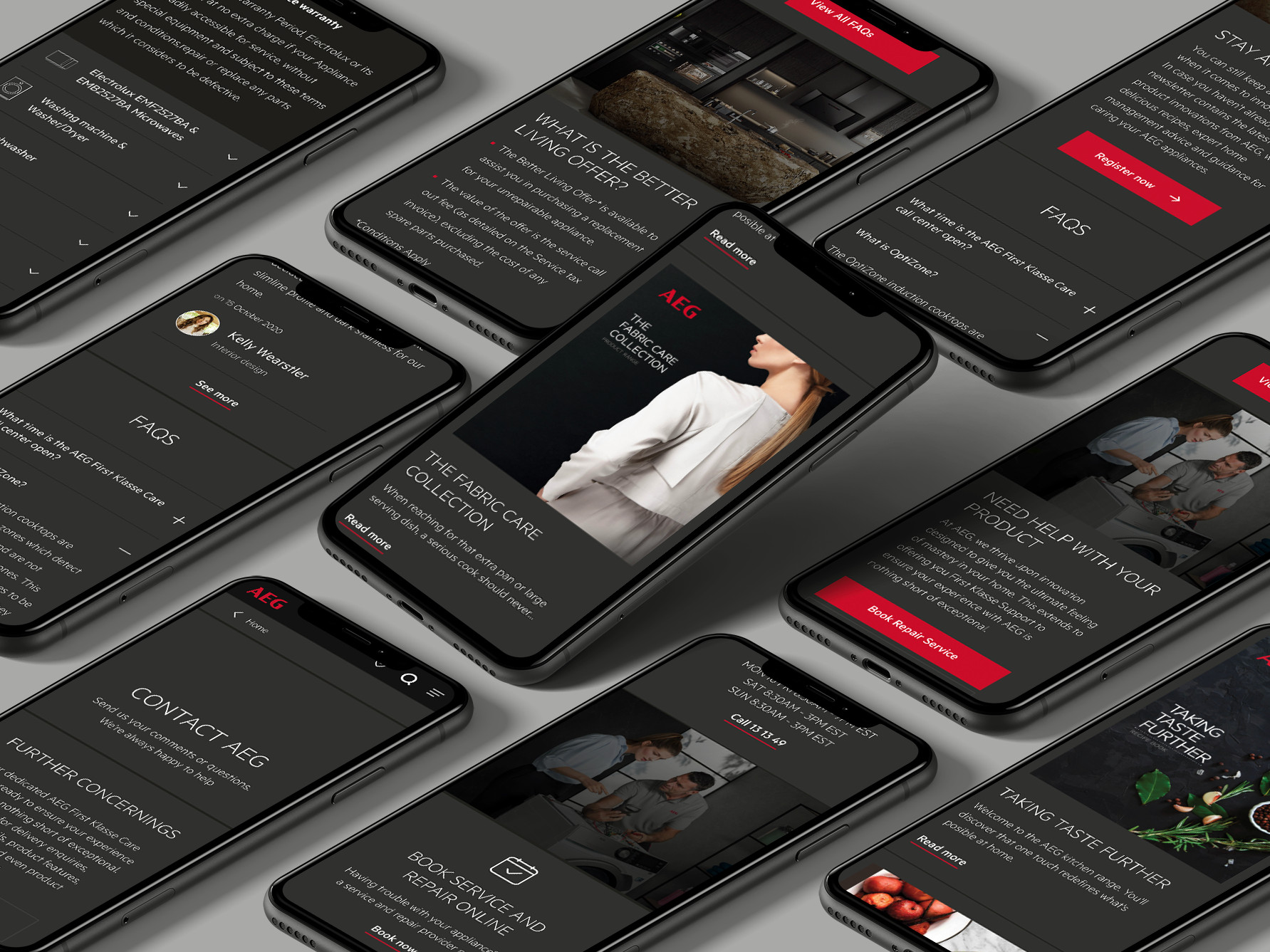
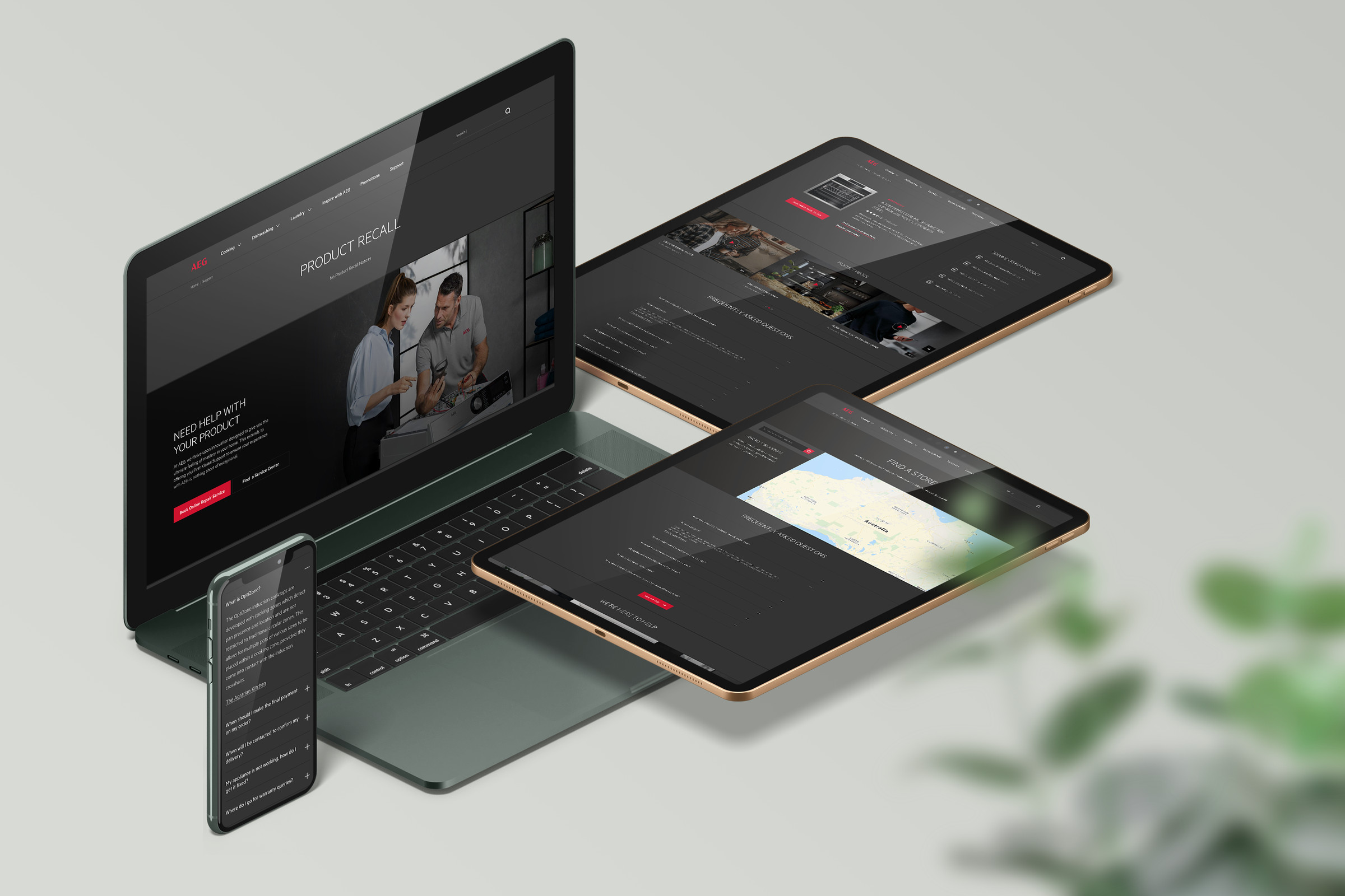
Customers find answers on their own, and support workload dropped by about 20%.
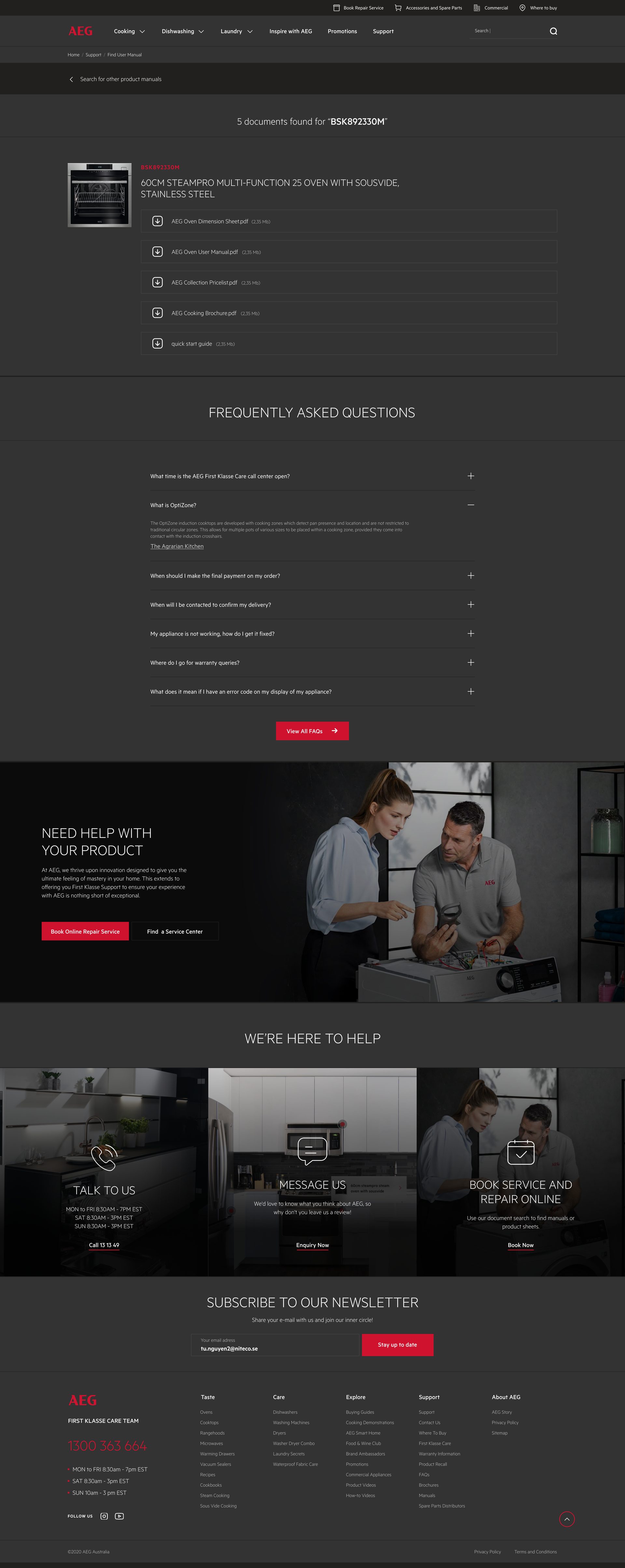
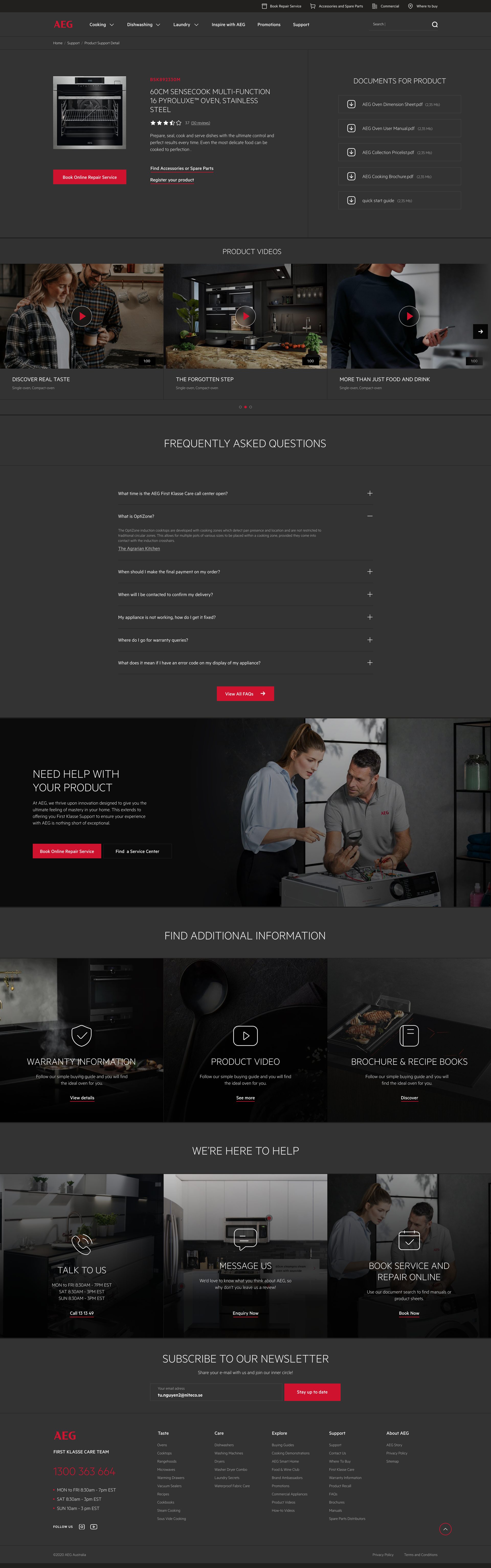
Ease of access. Users can easily find essential information such as product manuals, warranty details and troubleshooting guides.
Self-service. Customers can solve common issues on their own without contacting customer support, without waiting for the team.
Quick navigation. The intuitive layout and organised information architecture let users find what they need quickly, saving time and effort.
How the 20% was measured. The figure comes from AEG’s support team, based on their call volume and ticket count, three months after the page launched.
What I learnt from this project.
Design a support page around what users need and want to do, not around how the UI looks.
A good-looking design keeps users engaged and makes the support more effective.
Any digital product should be easy to move around, with a clear hierarchy and pathways to follow.
A redesign isn’t a one-time process. Keep improving the design based on user feedback and testing.
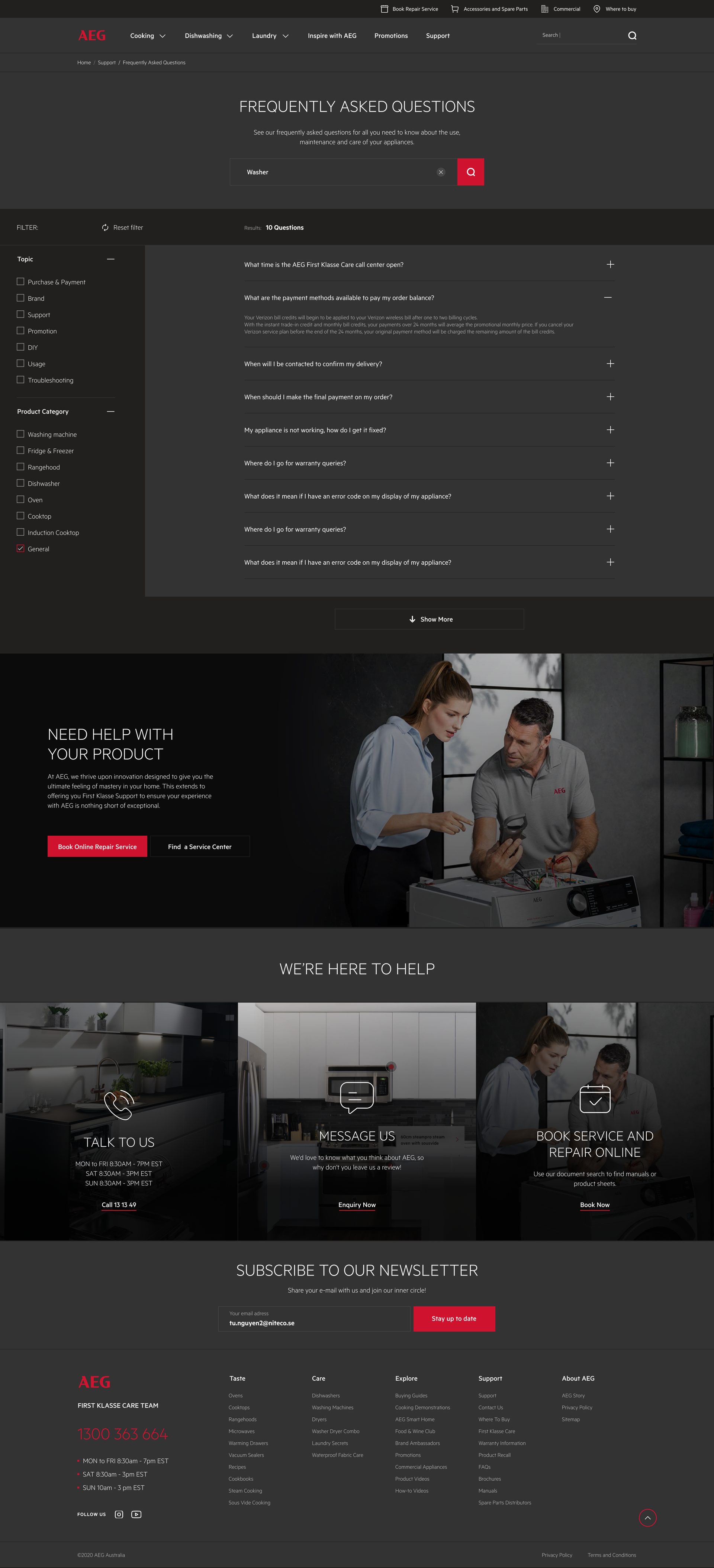
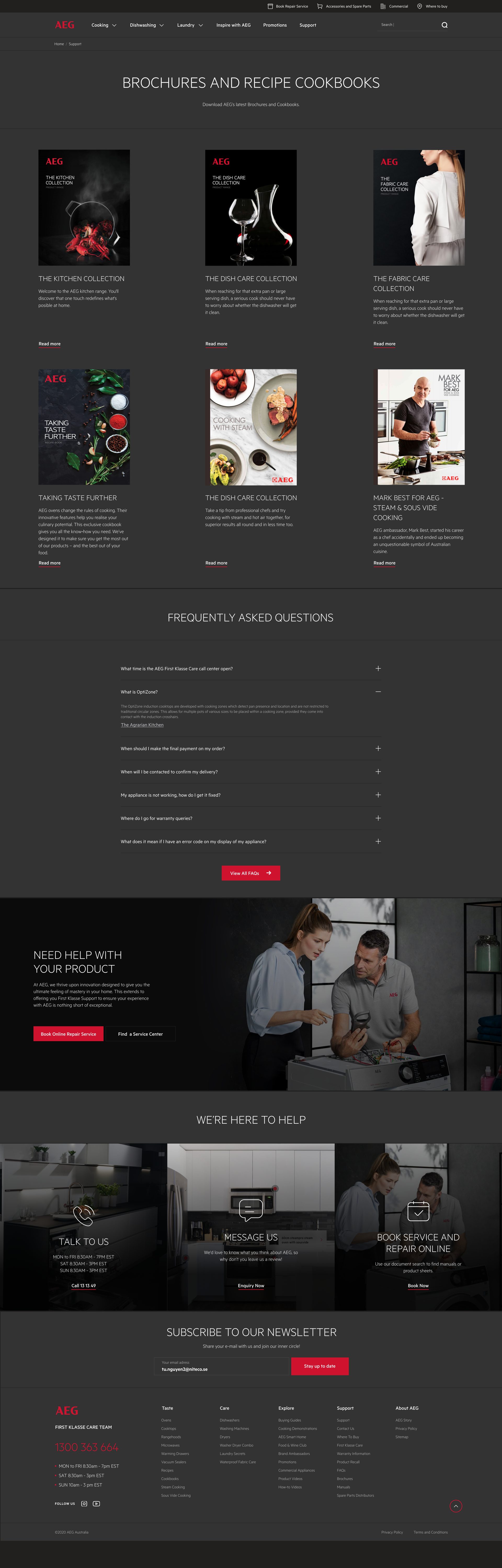
The support section, screen by screen.